
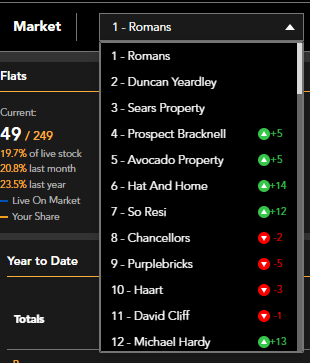
You can easily access information about the active market in your area, whether it's your own agency or any other agent. To switch between agencies, simply use the 'Market' dropdown menu and select the specific agency you want to view. This feature allows you to compare and analyse the performance of different agencies.
 The four graphs at the top of the page provide a comprehensive overview of the current market activity based on property type and the number of bedrooms. These graphs offer valuable insights into the active market position, allowing you to assess the demand and trends in your area. By analysing the data presented in these graphs, you can make informed decisions and stay ahead of the competition.
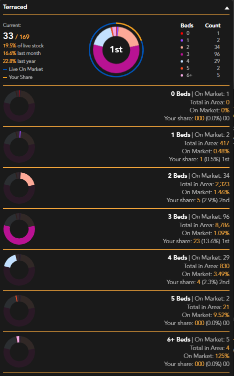
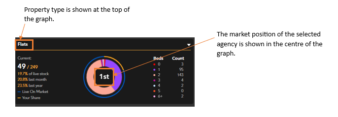
The White number on the left hand side of the graph shows the number of each property type that is being advertised by the highlighted agent. Beneath this you can see the percentage of live stock the agency is advertising along with the percentage last month and last year.
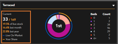
The Blue line around the graph represents all live listings of this property type, the Orange line represents the market share of the highlighted agent.
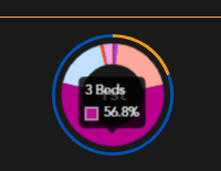
The graph is segmented by number of bedrooms. The percentages can be viewed by hovering over the graph, the count can be seen with a colour key to the right hand side of the graph.

Each property type graph can be expanding to show a detailed breakdown:
If you have any questions or run into any issues, don't hesitate to reach out to our support team at customer.success@sprift.com or 0207 096 0847.
We're always here to help you get the most out of the platform.